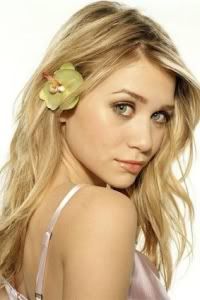
Post by Yoona Im on Oct 10, 2011 20:58:55 GMT -5
Hello Girls
Welcome to Second Judging Session!!! Tonight, another model will be eliminated from the competition. It's going to get tougher week after week.
Let's see how you doing this week with your Mentor's Choice
Team Amanda with Hats

Yoona: I think you did better than last week. I love the pose and the eyes especially. I think you should relax your lips more. It's a lil bit awkward but overall, i really like this photo
Diego: I totally agree with Yoona. I love the pose and the eyes and the lips are awkward but it's very beautiful.
Karen: I think the pose is really strong, but I'm not a big fan of the facial expression. It's somewhere between "Aagh! There's a badger in my kitchen!" and "Come on over here, handsome..." to me, and I'm not sure whether you're supposed to be alluring or shocked. But other than that, it's pretty good photo, and definitely fits with the theme. Great work!
Brody: Like everyone else, I'm not really a huge fan of the facial expression. I realy like the pose though. Also, I think the quality of the picture could be a little better.

Yoona: This is so cute. Very modelsque for me. From your pose, background, and styling. I love it. I can felt the story behind this photo
Diego: Personally i think this picture is just ok. You look kind of boring and my eyes tend to go to everything else because it's messy and your just plain.
Brody: I'm not really sure how Diego can say this is boring, When I look at it I start trying to figure out exactly what is going on in this picture. There has to be a story behind it and I start trying to piece it together. The only problem I have is that I'm not a huge fan of the coloring but I guess it helps to set the mood.
Karen: I'm also not a huge fan of the coloring. I do like the fact that there's a bit of a story going on here, which makes the photo intriguing, but the pose definitely seemes more bored and listless than anything, and the outfit doesn't really seem to make much sense to me. But, it's still a reasonbly strong effort.

Diego: I like this photo a lot. The faded around the sides make you the center of attention. The one thing i dont like is your smile it seems too cheesed.
Yoona: I think this is a good photo. I'm not too excited with it because you look too commercial and catalogue-ish for me. I want to see you with the high fashion element more in your next shoot
Brody: Yeah the smile is a little awkward. I'm not a huge fan of the fading around the edges either. It's okay though and it will work. Def. not the best this week but you should be able to survive.
Karen: This photo doesn't particularly look like you, but I'm definitely impressed by the fact that you aren't wearing a cowboy hat, because that's really what I figured we'd be seeing from you. The pose is cute and the hair is great. Well done!
Team Diego with Nature

Karen: Dakota, this is a pretty good shot, but I'm really kind of iffy on the pose. The hands are a bit bizarre, and the facial expression doesn't really sell it for me. That being said, everything else is pretty stunning. The outfit is delightful, and it works with the background beautifully. Your accessories are great, the shoes are great, and the lighting really makes it all quite sublime.
Yoona: The hands kinda distracted me but I still impressed with this shoot. You look very beautiful and the dress is beautiful. I can feel the nature element in this photo too
Amanda: I really like this, but at the same time I don't like the arms just as with Karen. The setting is great, although the skirt is a bit overwhelming and sort of gets my attention a bit too much. Everything else is great, although your age is obvious... but that's not a huge deal.
Brody: The pose just seems a little awkward, to be honest the whole photo does. I'm not really a huge fan of this. The outfit is a little bizarre and all over the place.

Amanda: If you hadn't told me that was a beach, I'd have never known. It's way too subtle, and the image is rather low-quality. I do like the dress and the innocence of your face, but a floral pattern dress isn't necessarily "natural." If I had to submit a nature photo I'd probably do something from Survivor (a profile shot). This seems like you're eating grapes on a neutral background, though I do see the "random ways" in which the grapes show nature. It just seems a bit TOO random though, especially since the photo feels setting-less to me...
You know I enjoyed you as Camilla but this one isn't doing as much for me as it could. It's just... okay for me, and that could be potentially bad news. And that sucks
Yoona: Yup I agree with Amanda, This is too subtle.. This is a beautiful photo but it's quite hard to relate it to your theme. I expect more from you Naomi and I knew you can do much better than this
Brody: This is honestly horrible. I dont' even see the nature in here. And like everyone else said, if you hand't said that was a beach i woudl have never known. You may be going this week.
Karen: I don't think that this is your strongest work, but I do definitely see some elements of nature here. Not a huge fan of the photo quality, but the pose is good, and I like the facial expression.
Team Karen with Hats

Yoona: Girl, I love this. Very quirky and fun. I love the background and styling. I think this is a very strong shoot. Good job
Diego: I agree with Yoona. I really like this photo and it's so beautiful. My favorite so far.
Amanda: This definitely shows who you are. Definitely. I'm not as huge a fan as it as the other two, but it's definitely a big step up from last week and you should have no problem moving on to the next round.
Brody: It's OK. Definatley not the best I've seen, but it works. The only part I really have a problem with is just the awkwardness level, but I guess thats kind of what you were going for.

Diego: I dont know what to think of this photo. It's too white.
Amanda: This doesn't leave an impression on me, either. The thing that gets my attention most is that bar at the bottom. Crop that shit out! The quality is also low and it sort of looks like the hat was Photoshopped onto your head. It just doesn't look like it's staying on tightly... and that's strange...
Yoona: This is totally a different side of you from last week You look sexy. I wish the photo would be more bigger. The hands a little bit distracting but I like the pose.
Brody: The photo does look photoshopped. If not that just that the hat was an afterthought to the pose and the shot. It's almost like you had the shot done and then someone decided "Let's add a hat". For "Hats" as a theme, I'm not sure how big of a fan I am of this.

Yoona: This is a good photo but compare to the one last week, this one is a little bit letdown for me. You set the level pretty high last week so I expected you to do better than better. The pose is strong, but the styling very gloomy.. I want to see the other side of you.
Diego: At first glance i loved the picture but now that i'm starting to get into it i'm not loving it so much. Not a fan of the tattoos on a girl and i dont like your face for some reason. Sorry.
Amanda: When I do a shoot with a hat, I prefer to be wearing it. I don't even know if that is a hat because it looks like it could be some sort of tray. I'm also very put off by the colors here. It's just depressing to look at. It's so dark and gloomy, and the tattoos don't do you any favors since soft, clean skin is preferred. To be honest, I don't really like this one much at all. The pose is good and all, but I really don't like anything else about it. Sorry.
Brody: At first glance I liked the photo, then I started thinking, "wait, what's the theme here?" Finally I scrolled down and read Amandas comments, went back up, slanted my computer screen and saw that you were in fact holding a HAT. So I'm guessing this is either hats or props, but most likely Hats. Like Amanda said, you should really be wearing it. Of course, I don't blame you, I blame your mentor. Your mentor really just wanted to do "hats" to make Amanda mad and piss her off. You were kind of the victim of that whole stupid movie. So sorry if it costs you this week, I hope it doesn't. I realize that it must have been hard for you to find a picture of a hat. I would have a talk with your mentor if I was you. As a mentor choosing a theme, I made sure that each model had a good photo they could use for the theme I chose.
Team Brody with Props

Yoona: I love the styling but I think you should tone down the trashy side. I think you don't have to try to be sexy, cause you're naturally sexy. I love the usage of Sofa as a prop for you. The expression still need a work though.
Diego: Not as great as last week but this is still good. I didnt know what the prop was until Yoona said the couch but it works. I also don't like the hair it's really wild and crazy.
Amanda: What's the theme for this? Is there even a prop here? When I think "prop," I think of something you have in your hands, something you're using. Not the thing you're sitting or laying on. I tend to disassociate that from "props." I also don't really like the lighting here, since it seems all over the place. Your outfit is questionable, especially since I do think it's kind of too trashy to be "model." Your hair is definitely not natural and I don't know if I like it (I'm also starting to hate that one image in my sig so I'll probably switch it out...). Your facial expression is also bland and your hair sort of obscures your eye. I want to see the look in your eyes! I like eyes. Smizing. Etc. Also, that weird bar at the bottom is a distraction and it's easy to crop out in Paint.
You ARE sexy, yes, but this seems like it's too much. Huge step down from last week, although I think you'll move on just fine.
Karen: The hair is a bit off-putting for me as well, though I like your facial expression (which is saying something, since I got after a few models for having their hair cover their eyes last season), and I think the pose is very, very good. I'm also a fan of the lighting, since it emphasizes your face very well. Not a huge fan of the sofa-as-prop business, because to me that's not really keeping with the theme, but other than that it's a good effort.

Amanda: I never knew you were this into music, Lindsay. This seems as if you are breaking free from music more than anything, but even so, I love it. This is a very artistic shot and it's very sexy and memorable. I am not completely fond of your facial expression but aside from that, this is gorgeous. A huge improvement from last week - well done!
Yoona: This is way much better than last week. Amazing usage of Prop. I love the pose. Very strong and your expression also fierce. Keep it up
Diego: This photo almost doesnt look like you. I love the usage of the prop. That's what won Taylor FCO last season and it may do it for you this season.
Karen: I'll agree that once again this photo really doesn't resemble you all that closely. I do think it's a very strong pose, and I love your use of the prop.

Yoona: This is remind me of Natalie's photo last season. The judges were not sure if the leaves can be consider as a prop. Same with this photo. I'm not really excited with the using of branch/tree as a prop but it was an okay photo. I think the pose should be better. I'm not really like the styling. I kinda like your picture with the bag more.
Diego: This seems more like nature then anything. I like it but i dont know if i can call it a prop, it wasnt placed there it was already there. But i love your face.
Amanda: I'm not sure how... pretty this is. Something about this makes me not want to give it a second thought. Not sure what it is. But yeah, like Natalie from last time... trees being a prop isn't the best interpretation. Natalie did survive that week, though, since her photo was gorgeous... and this isn't. Sorry.
Karen: I'll also agree that the tree doesn't seem to be that much of a prop, but you did do very well with the outfit and the facial expression.
Welcome to Second Judging Session!!! Tonight, another model will be eliminated from the competition. It's going to get tougher week after week.
Let's see how you doing this week with your Mentor's Choice
Team Amanda with Hats

Yoona: I think you did better than last week. I love the pose and the eyes especially. I think you should relax your lips more. It's a lil bit awkward but overall, i really like this photo
Diego: I totally agree with Yoona. I love the pose and the eyes and the lips are awkward but it's very beautiful.
Karen: I think the pose is really strong, but I'm not a big fan of the facial expression. It's somewhere between "Aagh! There's a badger in my kitchen!" and "Come on over here, handsome..." to me, and I'm not sure whether you're supposed to be alluring or shocked. But other than that, it's pretty good photo, and definitely fits with the theme. Great work!
Brody: Like everyone else, I'm not really a huge fan of the facial expression. I realy like the pose though. Also, I think the quality of the picture could be a little better.

Yoona: This is so cute. Very modelsque for me. From your pose, background, and styling. I love it. I can felt the story behind this photo
Diego: Personally i think this picture is just ok. You look kind of boring and my eyes tend to go to everything else because it's messy and your just plain.
Brody: I'm not really sure how Diego can say this is boring, When I look at it I start trying to figure out exactly what is going on in this picture. There has to be a story behind it and I start trying to piece it together. The only problem I have is that I'm not a huge fan of the coloring but I guess it helps to set the mood.
Karen: I'm also not a huge fan of the coloring. I do like the fact that there's a bit of a story going on here, which makes the photo intriguing, but the pose definitely seemes more bored and listless than anything, and the outfit doesn't really seem to make much sense to me. But, it's still a reasonbly strong effort.

Diego: I like this photo a lot. The faded around the sides make you the center of attention. The one thing i dont like is your smile it seems too cheesed.
Yoona: I think this is a good photo. I'm not too excited with it because you look too commercial and catalogue-ish for me. I want to see you with the high fashion element more in your next shoot
Brody: Yeah the smile is a little awkward. I'm not a huge fan of the fading around the edges either. It's okay though and it will work. Def. not the best this week but you should be able to survive.
Karen: This photo doesn't particularly look like you, but I'm definitely impressed by the fact that you aren't wearing a cowboy hat, because that's really what I figured we'd be seeing from you. The pose is cute and the hair is great. Well done!
Team Diego with Nature

Karen: Dakota, this is a pretty good shot, but I'm really kind of iffy on the pose. The hands are a bit bizarre, and the facial expression doesn't really sell it for me. That being said, everything else is pretty stunning. The outfit is delightful, and it works with the background beautifully. Your accessories are great, the shoes are great, and the lighting really makes it all quite sublime.
Yoona: The hands kinda distracted me but I still impressed with this shoot. You look very beautiful and the dress is beautiful. I can feel the nature element in this photo too
Amanda: I really like this, but at the same time I don't like the arms just as with Karen. The setting is great, although the skirt is a bit overwhelming and sort of gets my attention a bit too much. Everything else is great, although your age is obvious... but that's not a huge deal.
Brody: The pose just seems a little awkward, to be honest the whole photo does. I'm not really a huge fan of this. The outfit is a little bizarre and all over the place.

Amanda: If you hadn't told me that was a beach, I'd have never known. It's way too subtle, and the image is rather low-quality. I do like the dress and the innocence of your face, but a floral pattern dress isn't necessarily "natural." If I had to submit a nature photo I'd probably do something from Survivor (a profile shot). This seems like you're eating grapes on a neutral background, though I do see the "random ways" in which the grapes show nature. It just seems a bit TOO random though, especially since the photo feels setting-less to me...
You know I enjoyed you as Camilla but this one isn't doing as much for me as it could. It's just... okay for me, and that could be potentially bad news. And that sucks

Yoona: Yup I agree with Amanda, This is too subtle.. This is a beautiful photo but it's quite hard to relate it to your theme. I expect more from you Naomi and I knew you can do much better than this
Brody: This is honestly horrible. I dont' even see the nature in here. And like everyone else said, if you hand't said that was a beach i woudl have never known. You may be going this week.
Karen: I don't think that this is your strongest work, but I do definitely see some elements of nature here. Not a huge fan of the photo quality, but the pose is good, and I like the facial expression.
Team Karen with Hats

Yoona: Girl, I love this. Very quirky and fun. I love the background and styling. I think this is a very strong shoot. Good job
Diego: I agree with Yoona. I really like this photo and it's so beautiful. My favorite so far.
Amanda: This definitely shows who you are. Definitely. I'm not as huge a fan as it as the other two, but it's definitely a big step up from last week and you should have no problem moving on to the next round.
Brody: It's OK. Definatley not the best I've seen, but it works. The only part I really have a problem with is just the awkwardness level, but I guess thats kind of what you were going for.

Diego: I dont know what to think of this photo. It's too white.
Amanda: This doesn't leave an impression on me, either. The thing that gets my attention most is that bar at the bottom. Crop that shit out! The quality is also low and it sort of looks like the hat was Photoshopped onto your head. It just doesn't look like it's staying on tightly... and that's strange...
Yoona: This is totally a different side of you from last week You look sexy. I wish the photo would be more bigger. The hands a little bit distracting but I like the pose.
Brody: The photo does look photoshopped. If not that just that the hat was an afterthought to the pose and the shot. It's almost like you had the shot done and then someone decided "Let's add a hat". For "Hats" as a theme, I'm not sure how big of a fan I am of this.

Yoona: This is a good photo but compare to the one last week, this one is a little bit letdown for me. You set the level pretty high last week so I expected you to do better than better. The pose is strong, but the styling very gloomy.. I want to see the other side of you.
Diego: At first glance i loved the picture but now that i'm starting to get into it i'm not loving it so much. Not a fan of the tattoos on a girl and i dont like your face for some reason. Sorry.
Amanda: When I do a shoot with a hat, I prefer to be wearing it. I don't even know if that is a hat because it looks like it could be some sort of tray. I'm also very put off by the colors here. It's just depressing to look at. It's so dark and gloomy, and the tattoos don't do you any favors since soft, clean skin is preferred. To be honest, I don't really like this one much at all. The pose is good and all, but I really don't like anything else about it. Sorry.
Brody: At first glance I liked the photo, then I started thinking, "wait, what's the theme here?" Finally I scrolled down and read Amandas comments, went back up, slanted my computer screen and saw that you were in fact holding a HAT. So I'm guessing this is either hats or props, but most likely Hats. Like Amanda said, you should really be wearing it. Of course, I don't blame you, I blame your mentor. Your mentor really just wanted to do "hats" to make Amanda mad and piss her off. You were kind of the victim of that whole stupid movie. So sorry if it costs you this week, I hope it doesn't. I realize that it must have been hard for you to find a picture of a hat. I would have a talk with your mentor if I was you. As a mentor choosing a theme, I made sure that each model had a good photo they could use for the theme I chose.
Team Brody with Props

Yoona: I love the styling but I think you should tone down the trashy side. I think you don't have to try to be sexy, cause you're naturally sexy. I love the usage of Sofa as a prop for you. The expression still need a work though.
Diego: Not as great as last week but this is still good. I didnt know what the prop was until Yoona said the couch but it works. I also don't like the hair it's really wild and crazy.
Amanda: What's the theme for this? Is there even a prop here? When I think "prop," I think of something you have in your hands, something you're using. Not the thing you're sitting or laying on. I tend to disassociate that from "props." I also don't really like the lighting here, since it seems all over the place. Your outfit is questionable, especially since I do think it's kind of too trashy to be "model." Your hair is definitely not natural and I don't know if I like it (I'm also starting to hate that one image in my sig so I'll probably switch it out...). Your facial expression is also bland and your hair sort of obscures your eye. I want to see the look in your eyes! I like eyes. Smizing. Etc. Also, that weird bar at the bottom is a distraction and it's easy to crop out in Paint.
You ARE sexy, yes, but this seems like it's too much. Huge step down from last week, although I think you'll move on just fine.
Karen: The hair is a bit off-putting for me as well, though I like your facial expression (which is saying something, since I got after a few models for having their hair cover their eyes last season), and I think the pose is very, very good. I'm also a fan of the lighting, since it emphasizes your face very well. Not a huge fan of the sofa-as-prop business, because to me that's not really keeping with the theme, but other than that it's a good effort.

Amanda: I never knew you were this into music, Lindsay. This seems as if you are breaking free from music more than anything, but even so, I love it. This is a very artistic shot and it's very sexy and memorable. I am not completely fond of your facial expression but aside from that, this is gorgeous. A huge improvement from last week - well done!
Yoona: This is way much better than last week. Amazing usage of Prop. I love the pose. Very strong and your expression also fierce. Keep it up
Diego: This photo almost doesnt look like you. I love the usage of the prop. That's what won Taylor FCO last season and it may do it for you this season.
Karen: I'll agree that once again this photo really doesn't resemble you all that closely. I do think it's a very strong pose, and I love your use of the prop.

Yoona: This is remind me of Natalie's photo last season. The judges were not sure if the leaves can be consider as a prop. Same with this photo. I'm not really excited with the using of branch/tree as a prop but it was an okay photo. I think the pose should be better. I'm not really like the styling. I kinda like your picture with the bag more.
Diego: This seems more like nature then anything. I like it but i dont know if i can call it a prop, it wasnt placed there it was already there. But i love your face.
Amanda: I'm not sure how... pretty this is. Something about this makes me not want to give it a second thought. Not sure what it is. But yeah, like Natalie from last time... trees being a prop isn't the best interpretation. Natalie did survive that week, though, since her photo was gorgeous... and this isn't. Sorry.
Karen: I'll also agree that the tree doesn't seem to be that much of a prop, but you did do very well with the outfit and the facial expression.

